Zentangle Patterns
I keep getting asked how I go about doing my zentangle designs and patterns so I thought I would do a little blog to show how I personally do things.
Getting started
I find pattern making and zentangle designs quite relaxing but don’t get me wrong, it takes a lot of brain power and energy to follow a piece through. The most important thing to start with is getting your paper and pens right, you want a combination that is comfortable for you personally. I have tried so many variations over the years and I defiantly have my favourites and I even found that some pens result in small blisters on your fingers after a few hours of drawing. The ink needs to flow smoothly so that you don’t find yourself tirelessly having to put unnecessary pressure on the pen to make it work properly.

Some pens that I find useful at the moment (starting from the best and going down) are:
- Staedtler Pigment Liner
- Faber-Castell PITT artist Pen
- Artline 200
- Sharpie Pens
I have also heard that Sakura Micron pens are fantastic so they are on my list to try next.

Step-by-step
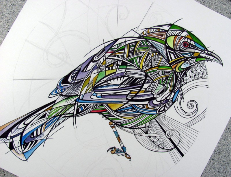
Above is a picture that I have already drawn a bird onto and the background will be zentangle patterns. Over the years I have watched many videos and tutorials on different patterns so I do have my favourites although it is nice to change it up every once in a while. I normally start the patterns in the background with some light pencil shapes and simple spirals which will later become part of the bigger design. I think it is important to do the simple pencil designs in such a way that when you step back the page looks overall balanced. I know it is quite hard to see (due to the very light pencil) but I hope the picture gives you some idea of what I mean.
After doing the pencil work I normally just start doing ink work, I don’t go into with much of a plan. I don’t work in one section and grow it, instead, I do small sections in different areas of the page and then grow them individually until they merge and interlock.
The picture above shows how I have done a few areas and how I am already starting to move to the top left of the picture and bottom left so that I can try to keep things balanced as I go. I don’t focus to much on the dark areas to begin with, I just put in a few small ones to give it a bit of contrast and variation. After I have done more of the initial layout work I step back and slowly start adding in more darker areas.
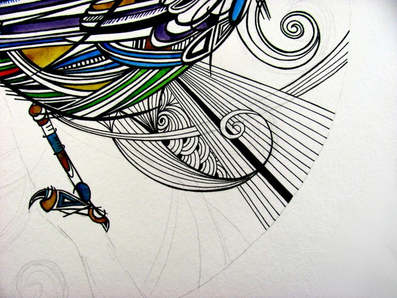
I did this photo to show you how the pencil work is being used as a guide line not a rule. Towards the end all these lines will be erased. By having the pencil lines there initially, I find it allows me to make curves and patterns flow over or under one another in a natural manner. You can see the light pencil line that curves under the lines flowing outwards.
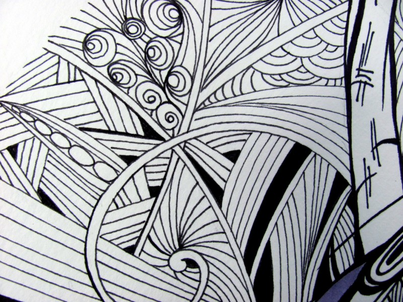
I try to keep lots of different things happening but it all depends on the look you are going for.
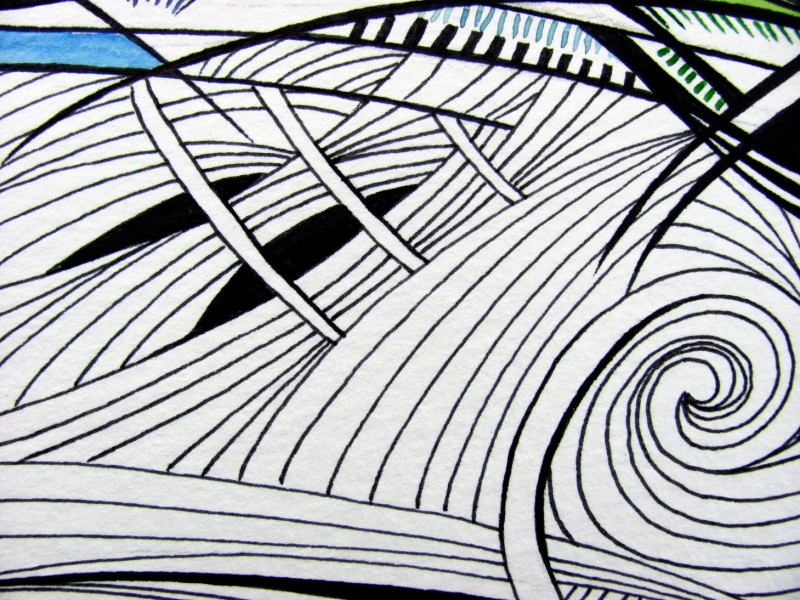
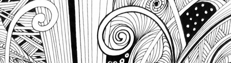
Overlapping areas always help create 3D spaces within your drawing. You can see above how important the dark areas are in helping to develop the depth illusion.
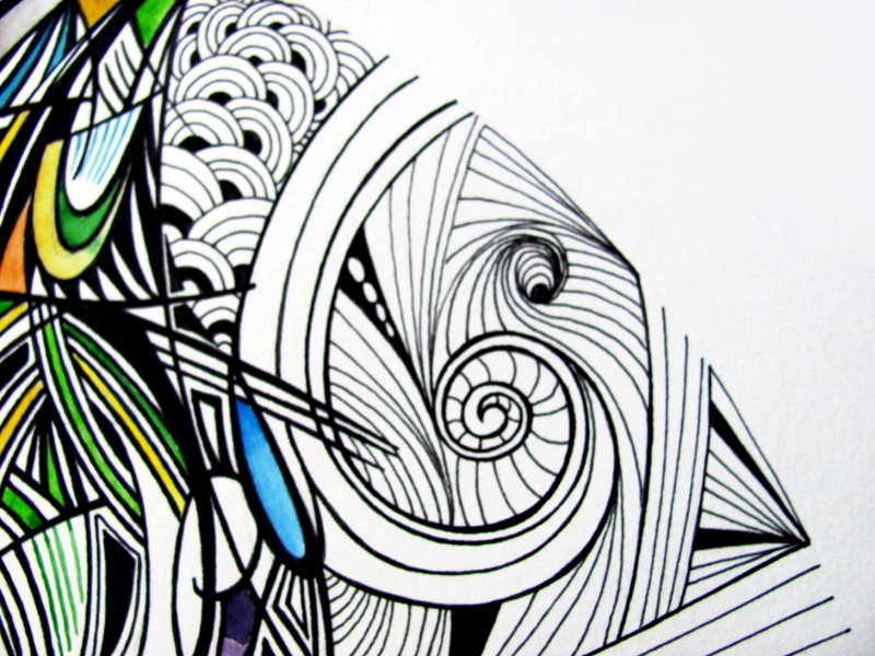
I do a lot of spiral designs as it reminds me of New Zealand Koru patterns but it can be very tricky to get the lines smooth and nicely rounded. I always turn the paper on an angle and use the pen in an arching stroke towards me as it feels most natural.
The finished picture
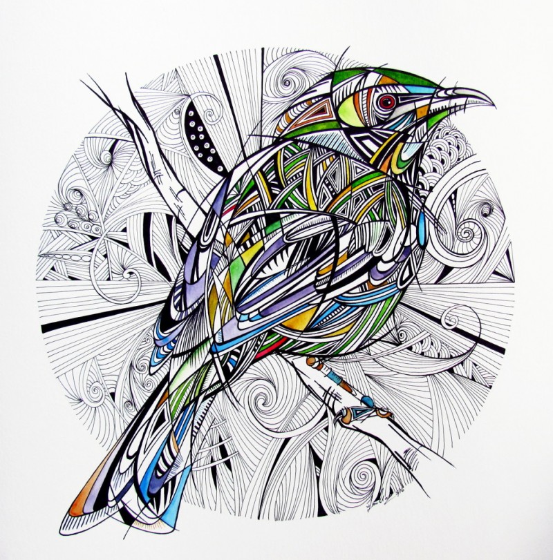
This is how the final piece looks, at the end of the day you can spend as many hours as you have refining and altering it. I have loaded some videos below if you are interested in seeing some of these techniques in action. This is just how I do it but please let me know if you would like any more information or have any questions. I would love to see some of your attempts! Please link me to them below.
Real-time Video
| Related Paintings | |||||
|
|
| |||


